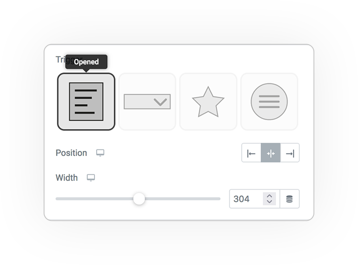
Opened
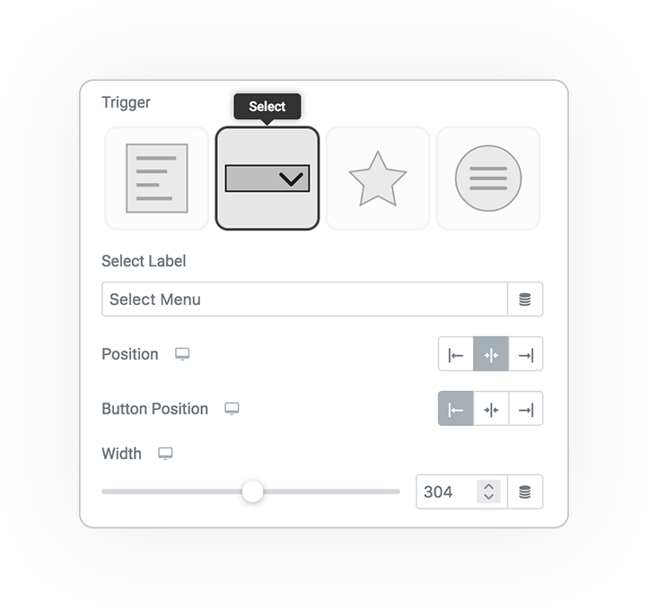
Select
Icon
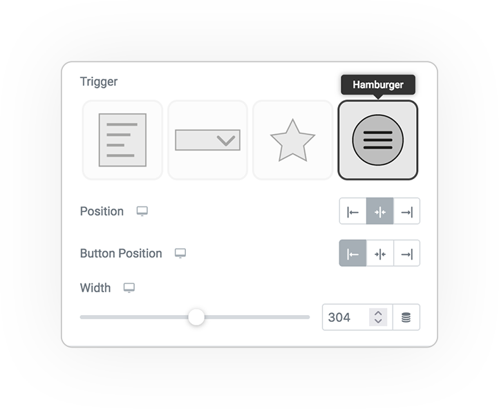
Hamburger
Multilevel Menu
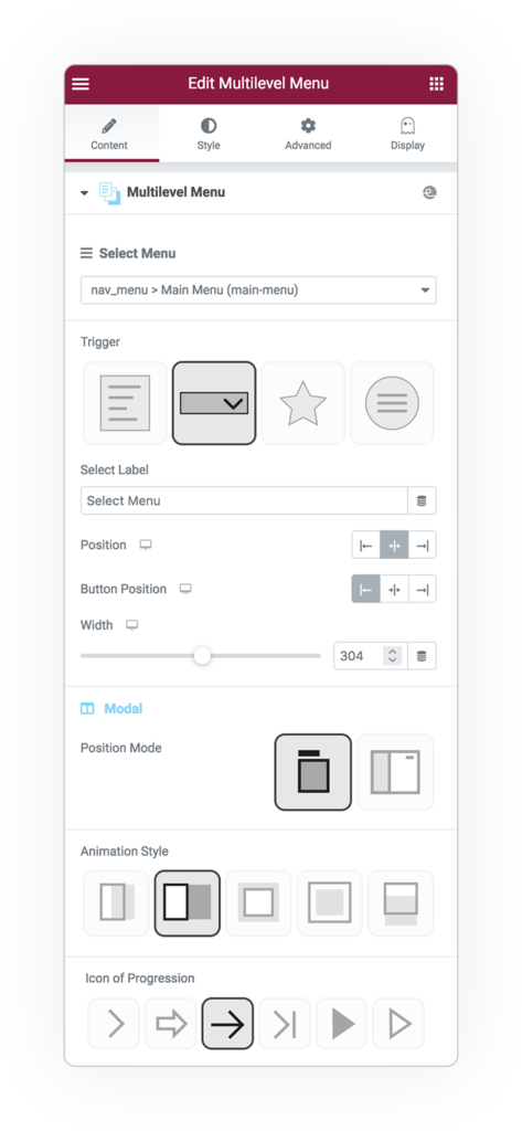
First select the WP Menu you previously generated from Apparence> Menu.
There are 4 triggers to manage the opening of the menu:
- Immediately open (ideal for popup or directly on page)
- From select with label
- From icon
- From hamburger
Positioning concerns: the menu as an object or the trigger button with respect to the menu.
For the select, icon and hamburger triggers, the menu can be positioned in 2 ways:
- Floating under the button
- OffCanvas with opening that can be positioned on the left or right
Styling animations can make navigations creative and adapt to layout needs.
Icon of Progression is the opening indicator when there are sub-elements.
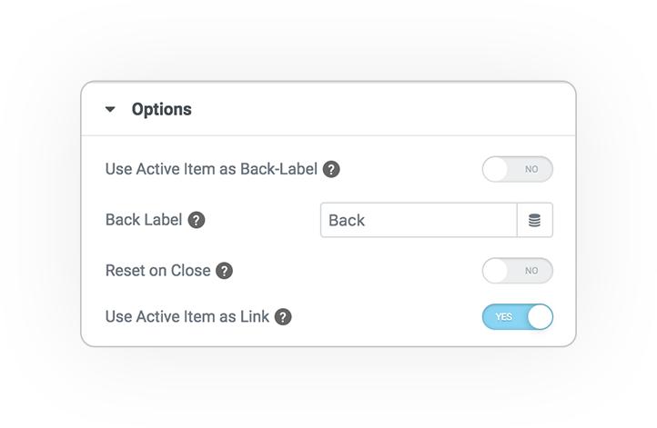
Options
Some options allow you to view the menu with features such as:
- Label Back or the item clicked
- In case of trigger the menu will reset on closing
- The clicked item will be displayed at the top in order to allow the click if linked
Styles
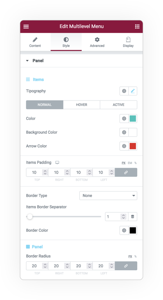
Panel
Colors, shape of the panel and menu items.
Items properties normal, hover and active status:
- Typography
- Colors of text and arrow
- Background Color
Furthermore
- Padding space
- Border radius
- Border style
The border between the entries might be different:
- Item border separator
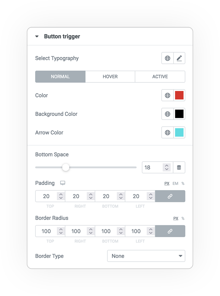
Trigger Button
The graphic appearance of the trigger button: select, icon or hamburger.
Properties normal, hover and active status:
- Typography
- Colors of text and arrow
- Background Color
Furthermore
- Padding space
- Border radius
- Border style
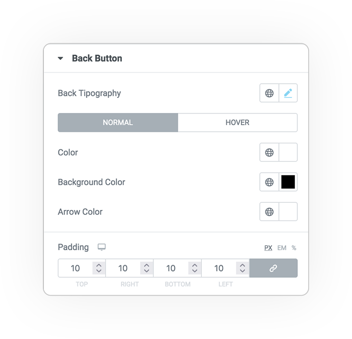
Back Button
The graphic characteristics of the back button if different from the menu items.
Properties normal and hover:
- Typography
- Colors of text and arrow
- Background Color
- Padding space
DEMO
Multilevel Menu
Base example


 e-User Interface