Content
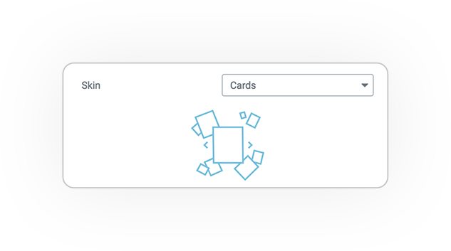
Cards skin consists of items distributed on a space of X / Y coordinates absolute.
The system is based on css3 transform.
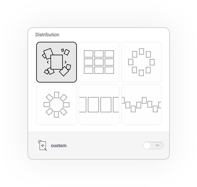
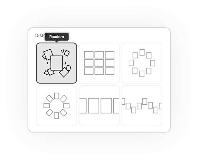
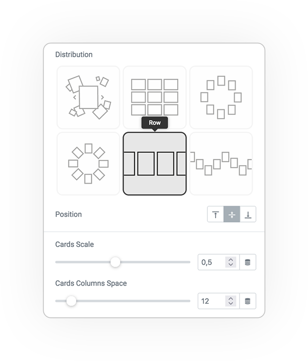
Random
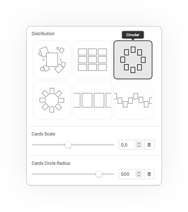
Circular
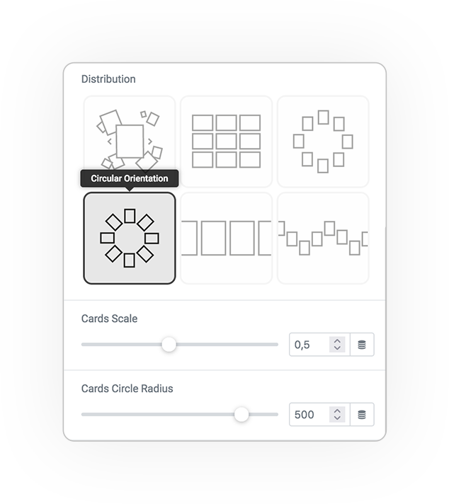
Circular Orientation
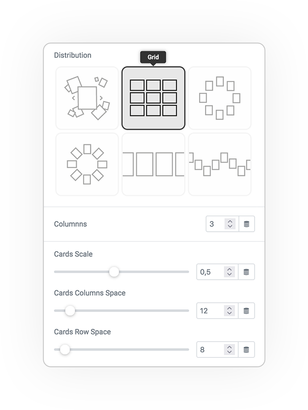
Grid
Row
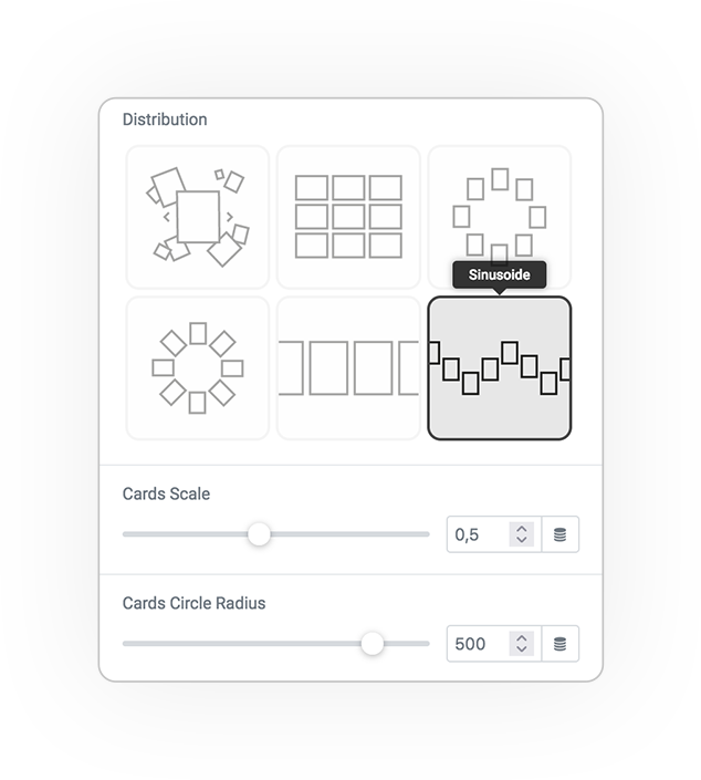
Sinusoide
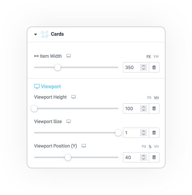
Cards Options
Item Width [responsive]:
- The width of the blocks, which affects the distribution of the items in it.
Viewport [responsive]:
- The height of the viewport (if empty, it will be like the height of the screen)
- The size (scale) of the composition
- The vertical position of the composition (Y), which may be better in some cases.
Distributions
There are some parameters to show the distribution for each method:
- Scale of Card
- Circle Radius for Circle and Sinusoide
- Columns and Row Spaces for Grid, Rows and Sinusoide
PLEASE NOTE
The elements are distributed absolutely in the viewport.
Random
Grid
Circular
Circular Orientation
Row
Sinusoide
Custom Coordinates
The magic of cards skin is in custom coordinates.
Through a transformation interface you can position each element as you want, distributing them in the viewport and navigate the elements!
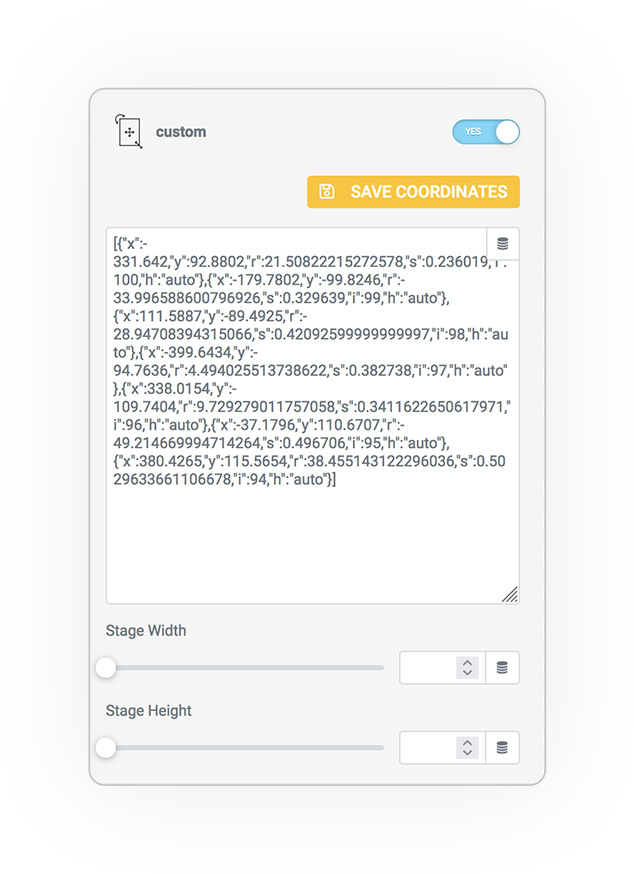
Don’t forget to save the coordinates after moving!
focused
While centering the element it is possible to define the values of the navigation tools (navigation arrows and the back-x), but above all the size of the element for mobile-first matters.
Scale
For mobile versions, you can size the focused element to control its alignment in the viewport.
Navigation elements such as the next / prev arrows can be offset for the x and y axes.
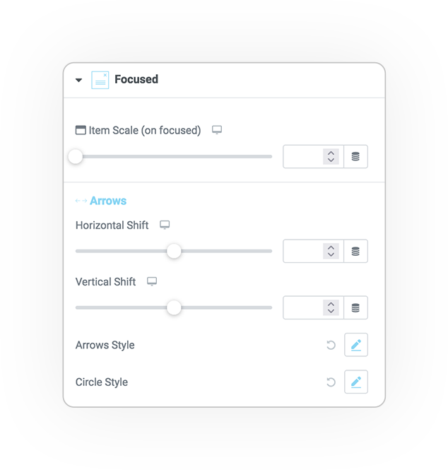
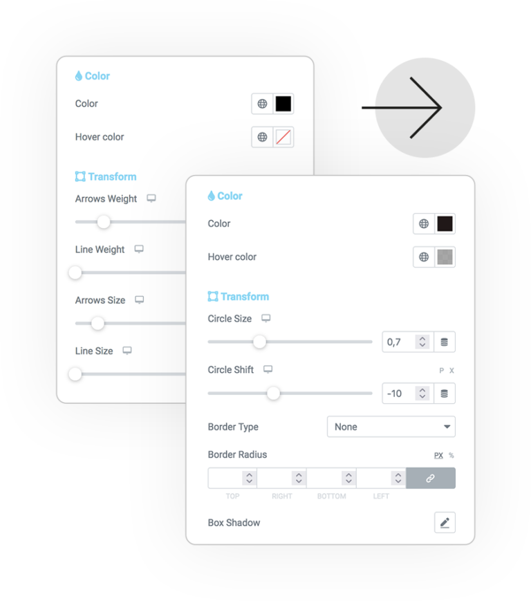
Arrows & Circle Style
Popup for total control of the graphic style:
- Color/hover
- Background
- Border
- Radius
- Shadow
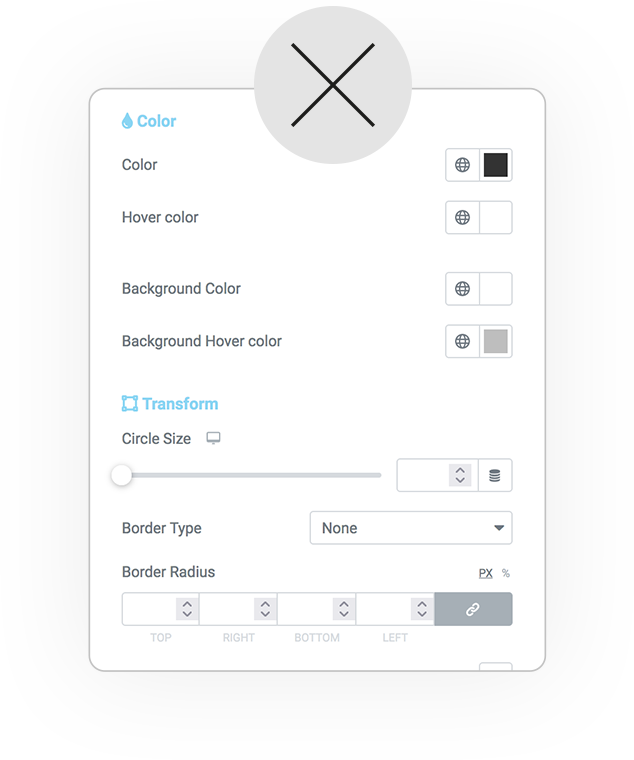
Close button Style
Also for closing control:
- Color/hover
- Background
- Border
- Radius
- Shadow
DEMO
Cards
Circular Orientation Distribution
Basic example


 e-Creative