Detect Mode
You can manage the detecting on the page in 2 ways.
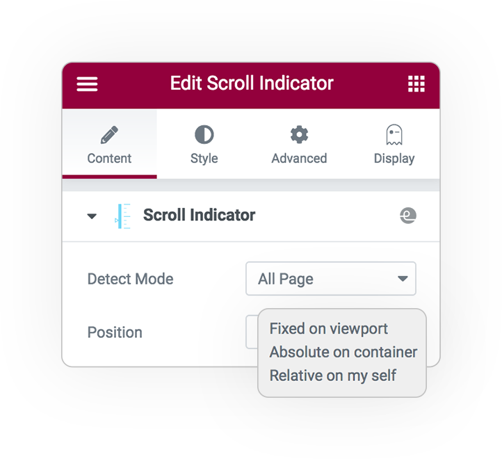
All Page
You will be able to create a personalized progress bar that covers the entire page and view the status of the position-percentage.
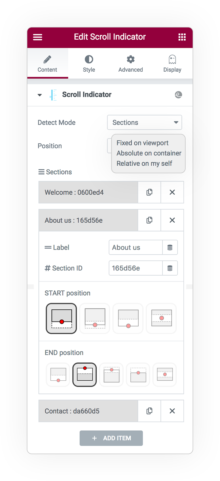
Sections
Otherwise, create N elements, even clickable, lean to the right or bottom to highlight the status of the position and navigate the page to the desired point.
To manage this it is necessary to define:
- The item Label
- The target #ID of Section or Element (see next paragraph*)
The POSITION trigger for the scrolling START and END point is very important. ***
This is the point at which the object is analyzed from the moment it appears in the viewport to the moment it ends; and it may be different based on the item you are analyzing
*** Sections Trigger
The triggering system checks the status of the position of the element between:
- Element
- Viewport
top bottom
center bottom
bottom bottom
center cener
top top
center top
bottom top
* Get the ID in any element
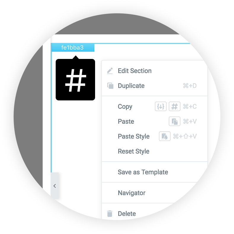
Right click
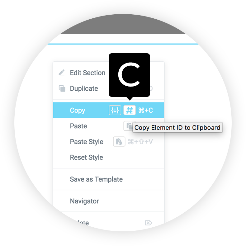
Copy ID
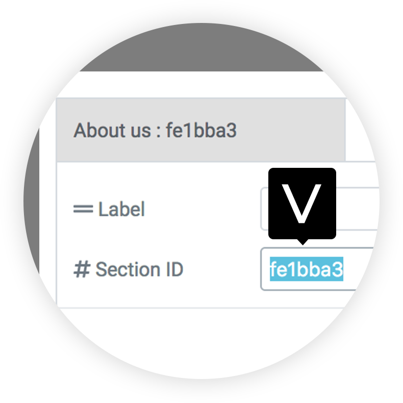
Paste in the field
Indicators
For the Detecting sections we have provided many styles, which can be of type: progress or bulllet, in addition a system based on svg.
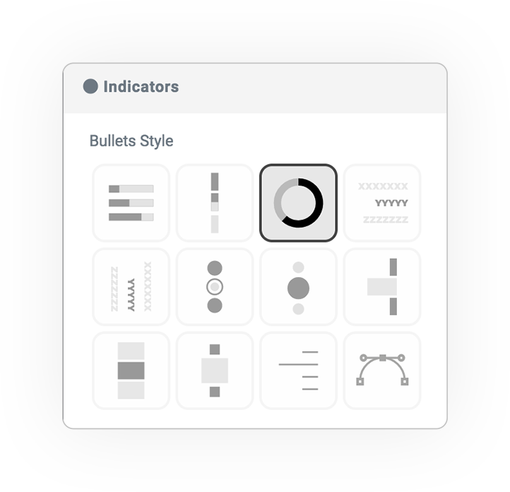
Bullets
Horizontal or vertical arrangement.
- Distance from the right or from the bottom
Numerous styles available to handle the style you want.
- Progress
- Side Progress
- Shapes SVG **
- Labels
- Vertical Labels
- Dots
- Circles
- Indent bars
- Bars
- Squares
- Lines
- CUSTOM PATH
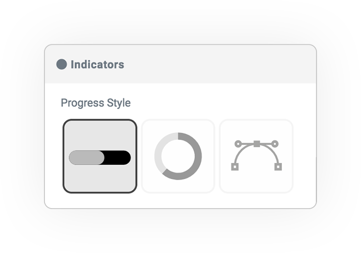
Progress
In the case of a progress bar for the whole page, you can arrange it with respect to the 4 sides and define its size and width.
- Distance
- Weight
- Height
- Rounded style
Progress SHAPE
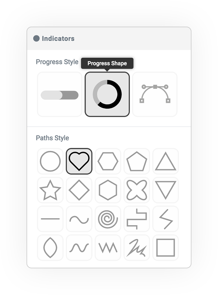
Custom PATH
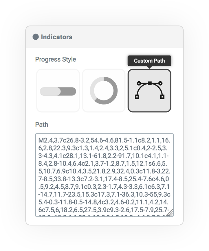
** Shapes SVG
SHAPES manages the progression along a svg form-path, there are 20 predefined designs.
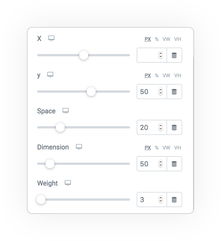
Transform
Style, size and position:
- X and Y
- Items space
- Dimension
- Weight
- Rounded style (only bars)
Direction &Position
Vertical
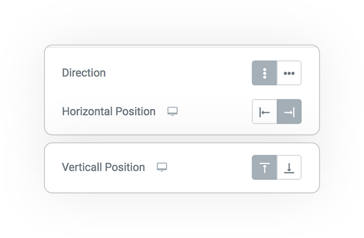
Horizontal
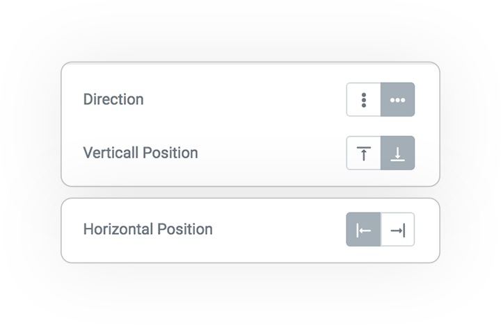
The second positioning parameter is optional, if not selected it will be centered
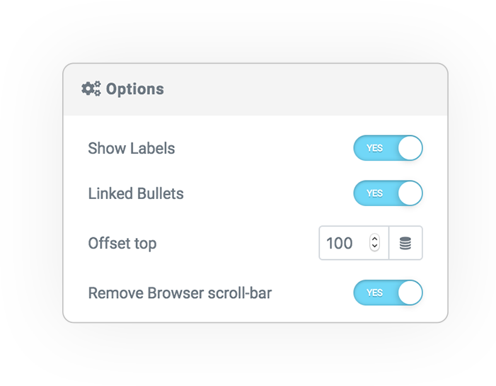
Options
Additional features:
- shows the text labels next to the indicator
- when clicked, the page scrolls on the element (optionally with offset in pixels).
- hide the browser’s native scroll bar
Styles
Bullets
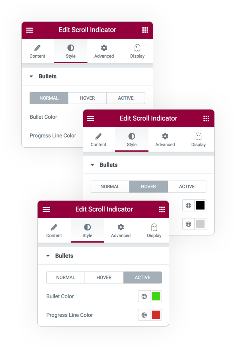
Custom colors for each state:
- Normal
- Hover
- Active
It concerns:
- Color
- Progress Line color
- Padding e Margin
Progress
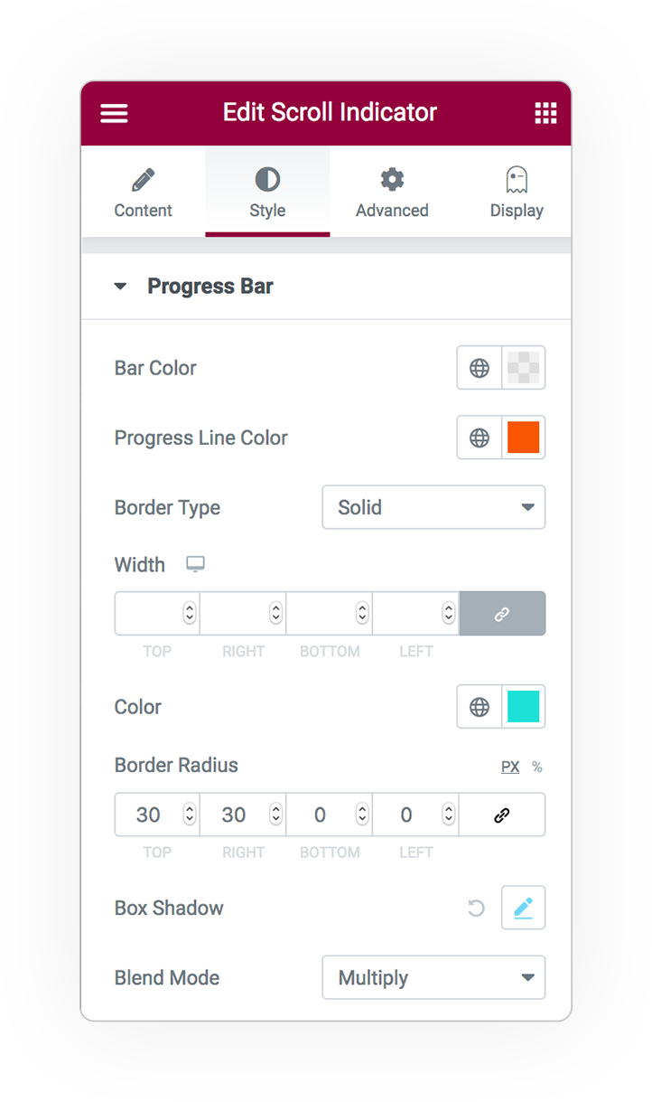
For the progress bar across the page.
- Color
- Progress Line color
- Padding and Margin
- Border
- 4 corners radius
- Blending mode of Progress bar


 e-User Interface