Tabs based on the content of sections built directly on the page
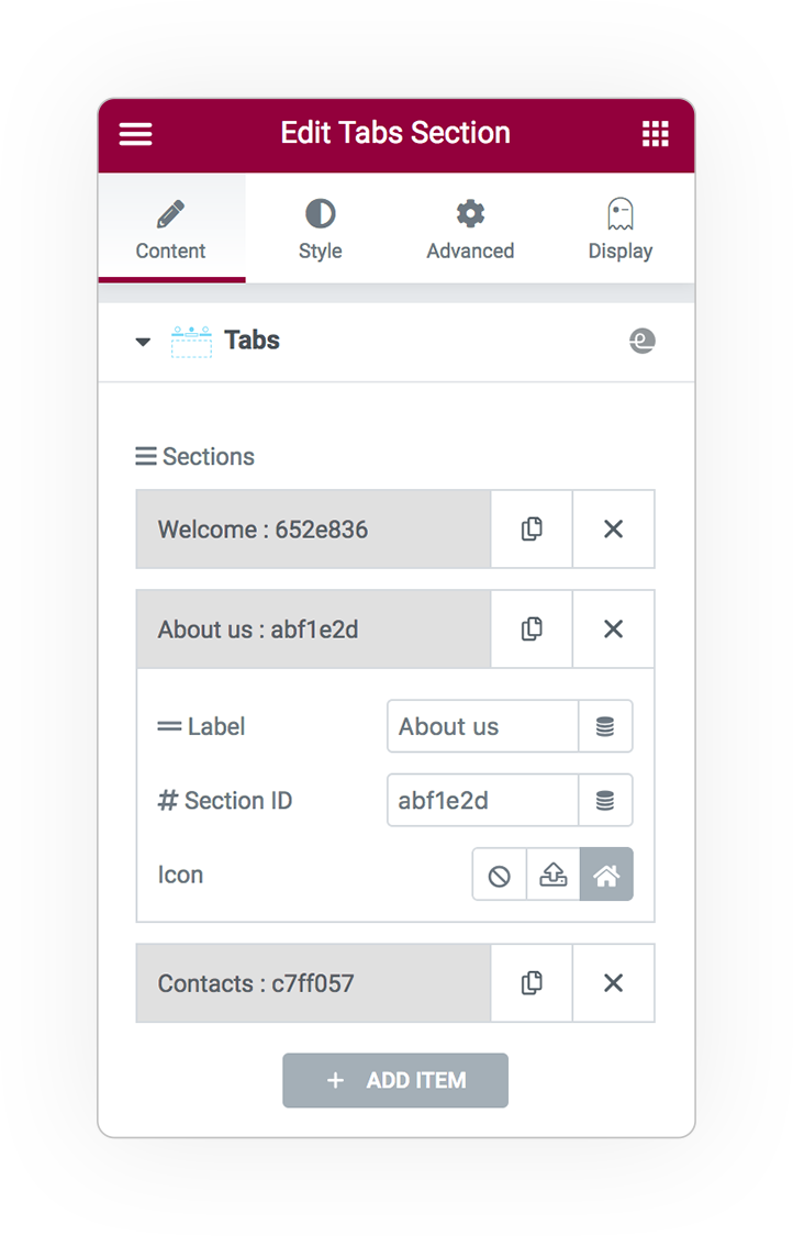
Sections
Define which sections you want to use as content and the characteristics of your tabs:
- The label of item
- The #ID target of section or element (view *)
- Tab icon
Tabs Style
You can choose from numerous graphic styles and build horizontal tabs that best suit your needs.
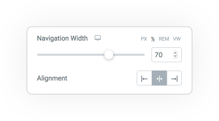
The width and position of the tabs complete the layout.
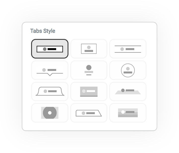
Bar
Icon Box
Line
Triangle
Flip up
Icon fall
Circle
Shape
Line Box
Flip
Circle Fill
Trapezoid
* Get the ID in any element
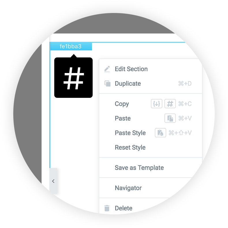
Right click
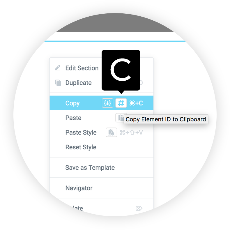
Copy ID
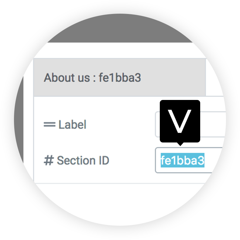
Paste in the field
Styles
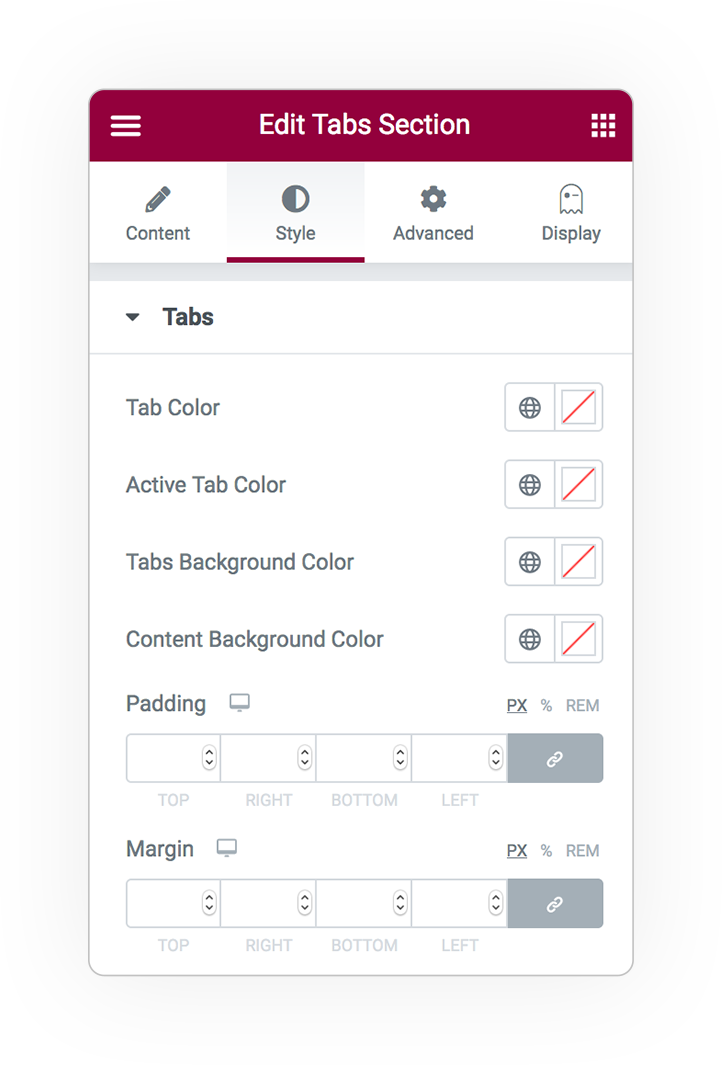
Colors
Custom colors for each state:
- Normal
- Active
for the following items:
- Tab color
- Tab background color
- Line color
- Background color of content (optional)
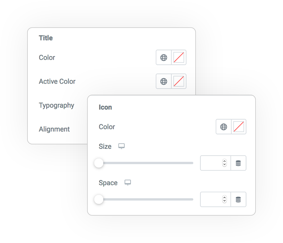
Title & Icon
Customize the title and icon based on your favorite style.
Title
- Color
- Typography
- Alignment
Icon
- Color
- Size
- Space
DEMO
Tabs Sections
Base example

Add Your Heading Text Here
Lorem ipsum dolor sit amet, consectetur adipiscing elit. Ut elit tellus, luctus nec ullamcorper mattis, pulvinar dapibus leo.


 e-User Interface