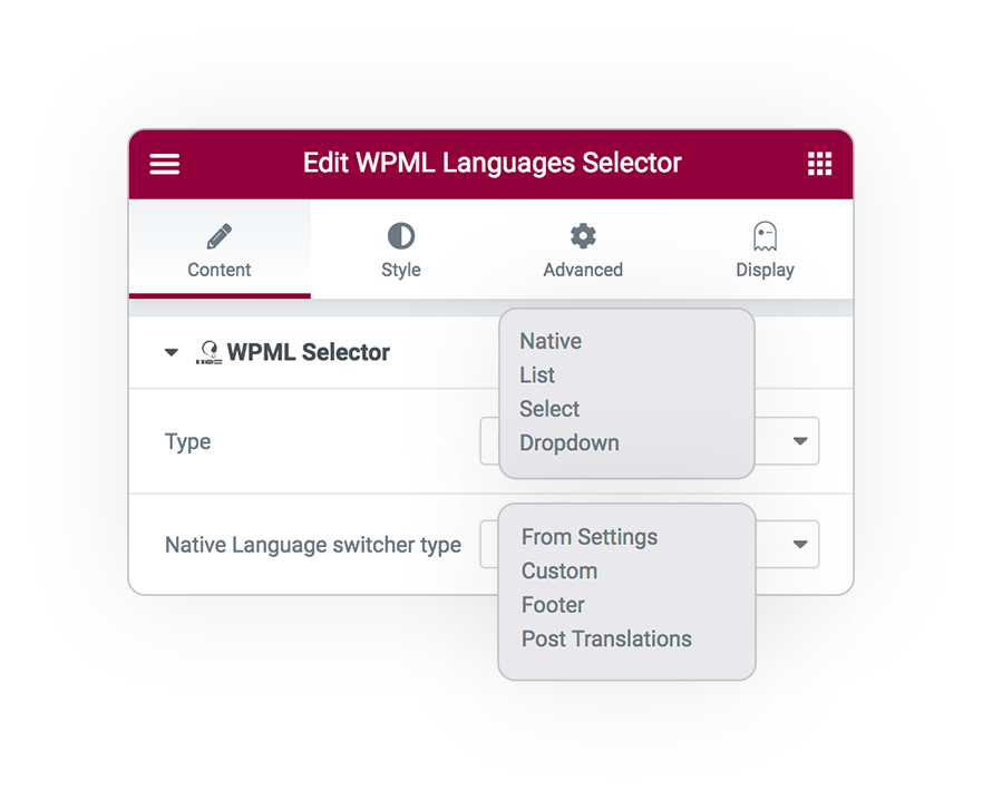
Native
From the wpml settings
List
An in line list
Select
Select module
Dropdown
Drop-down menu
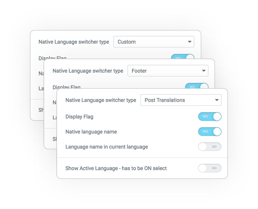
Native language selector
Play and customize your choice of language wherever you want using the settings defined in WPML > Languages > […]
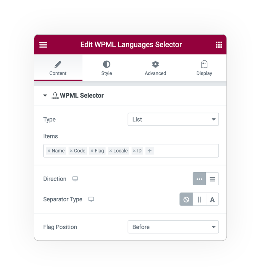
List
A horizontal or vertical list
Basically it is a [ul>li>a] that collects languages, the current language is not linked
The elements that can be displayed are:
Flag
- Name in the original language
- Name in the current language
- The abbreviated code (EN, DE etc.)
- Locale is the language in code form (en_UK, en_US)
- The Id of the language for development
Separator
The separator can be a separator border (for both directions)
or a standard character (| / – or other)
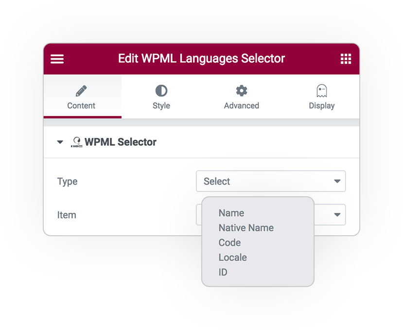
Select
Select option
The classic option selector used for forms.
In the option field you can choose what to display:
- Name in the original language
- Name in the current language
- the abbreviated code (EN, DE etc.)
- the language ID [dev]
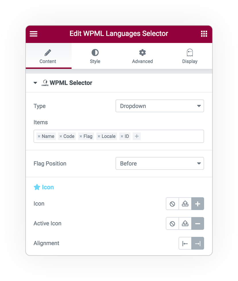
Dropdown
A graphically configurable animated drop down selector with many options.
- Items: are the items displayed
- The position of the flag if actived
- The language code (EN, DE ..)
- Also the id of the language for development
The dropdown opening icon and its location.
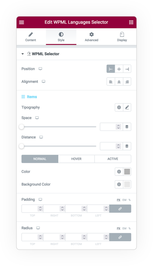
List and items Style
The style is fully manageable for each type:
- Position and alignment
For items:
- Typography
- Space
- Distance
- Colors
- Padding
- Background and radius
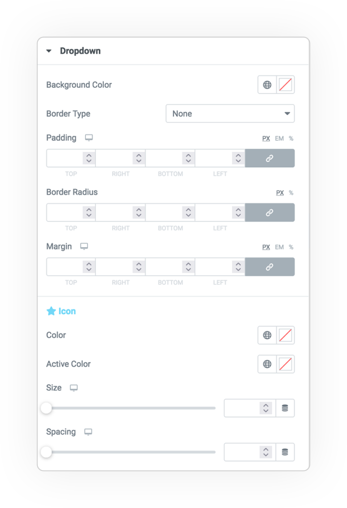
Dropdown panel style
In dropdown mode the opening panel can be configured with:
- Background
- Border
- Margin and Padding
- Icon
- color
- size
- space


