Easily redesign your Archive Pages with the power of the Query Widgets
Content
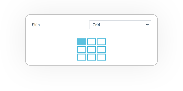
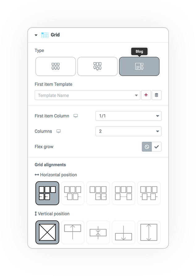
The grid skin is responsive and allows you to manage blocks in 3 logics: Flex, Masonry e Blog.
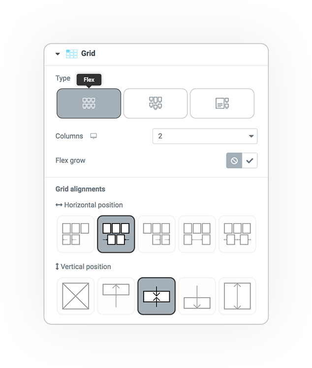
Flex
Responsive Columns.
From 1 to 7.
Flex grow: 0(zero) or 1
The flex grid has horizontal and vertical alignments.
- Top or Left
- Center or Middle
- Bottom or Right
- Space Between
- Space Around
- Stretch (Vertical flex align)
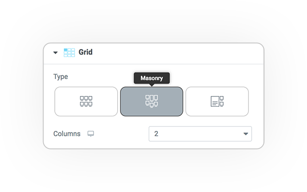
Masonry
The grid in method Masonry.
Blog
The BLOG style grid consists of 2 parts: the first element and all others.
It is possible to define logics for the 2 grids.
1/1, 1/2, 1/3, 1/4, 2/3, 3/4, 3/5, 4/5
Grid alignments
- Horizontal position
- Vertical position
Style
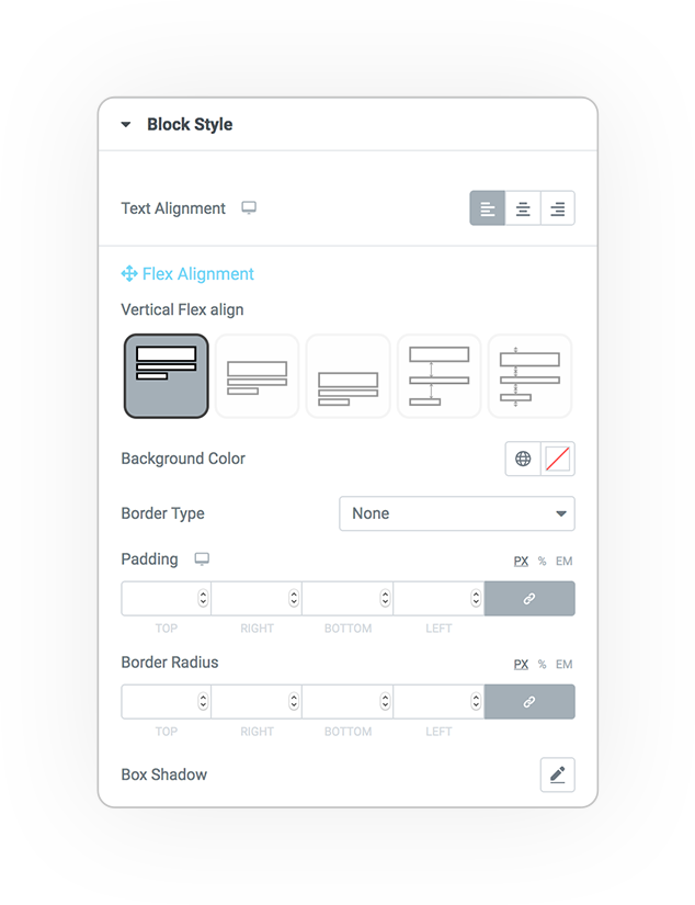
Block
These parameters allow you to control the graphic style of the blocks.
- Text alignment
- Vertical flex align
- Background
- Border
- Padding
- Margin
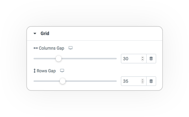
Grid
Spacing:
- Columns (horizontal)
- Rows (vertical)
DEMO
Grid
Base example


