The accordion view is ideal for optimizing the layout and improving the content hierarchy
Content

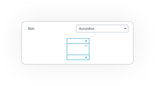
The skin Accordion display multiple rows of content in a simple and compact way.
Accordion Options
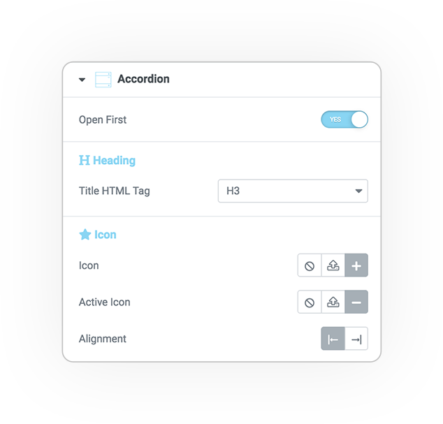
Initially open
On load, it opens the wanted element: first, all or none
Single Item open
Make accordion opened items close when another item is opened
Heading
Pick the size of the header based on HTML semantic tag
Icon/SVG
- Upload a custom image for normal and active state
- Left or right alignment

Style
Accordion
Bar
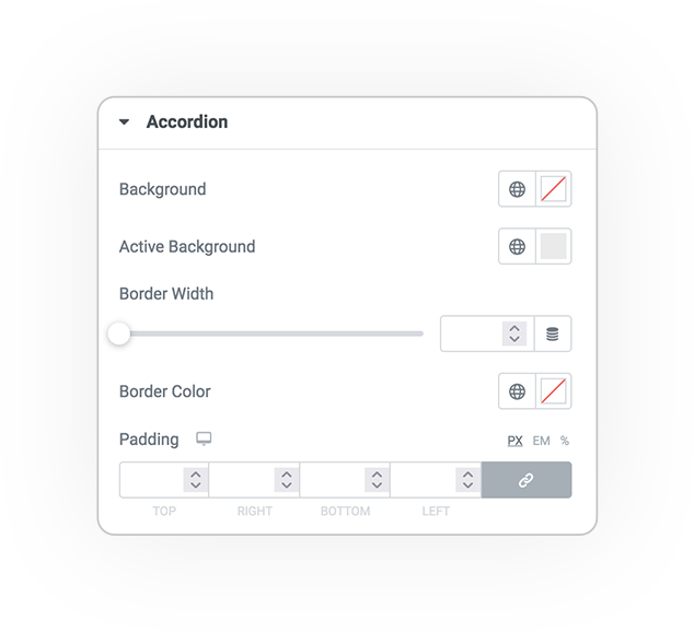
Edit the style of the accordion top bar.
- Background
- Border
- Padding and dimension

Title & Icon
Edit title and icon styles.
- Typography
- Normal Hover and Active Color
- Dimensions
- Spacing
DEMO
Accordion
Basic example
Sed nibh nibh facilisis euismod
Praesent at ex mi. Phasellus faucibus
Nulla dictum eget ipsum non euismod


 e-QUERY

