Options Field Extension
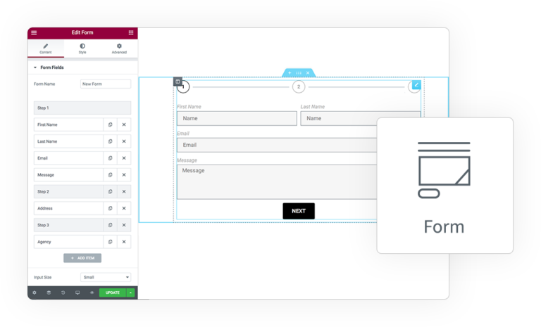
This extension add many extra features to Radio and Checkbox Field type.
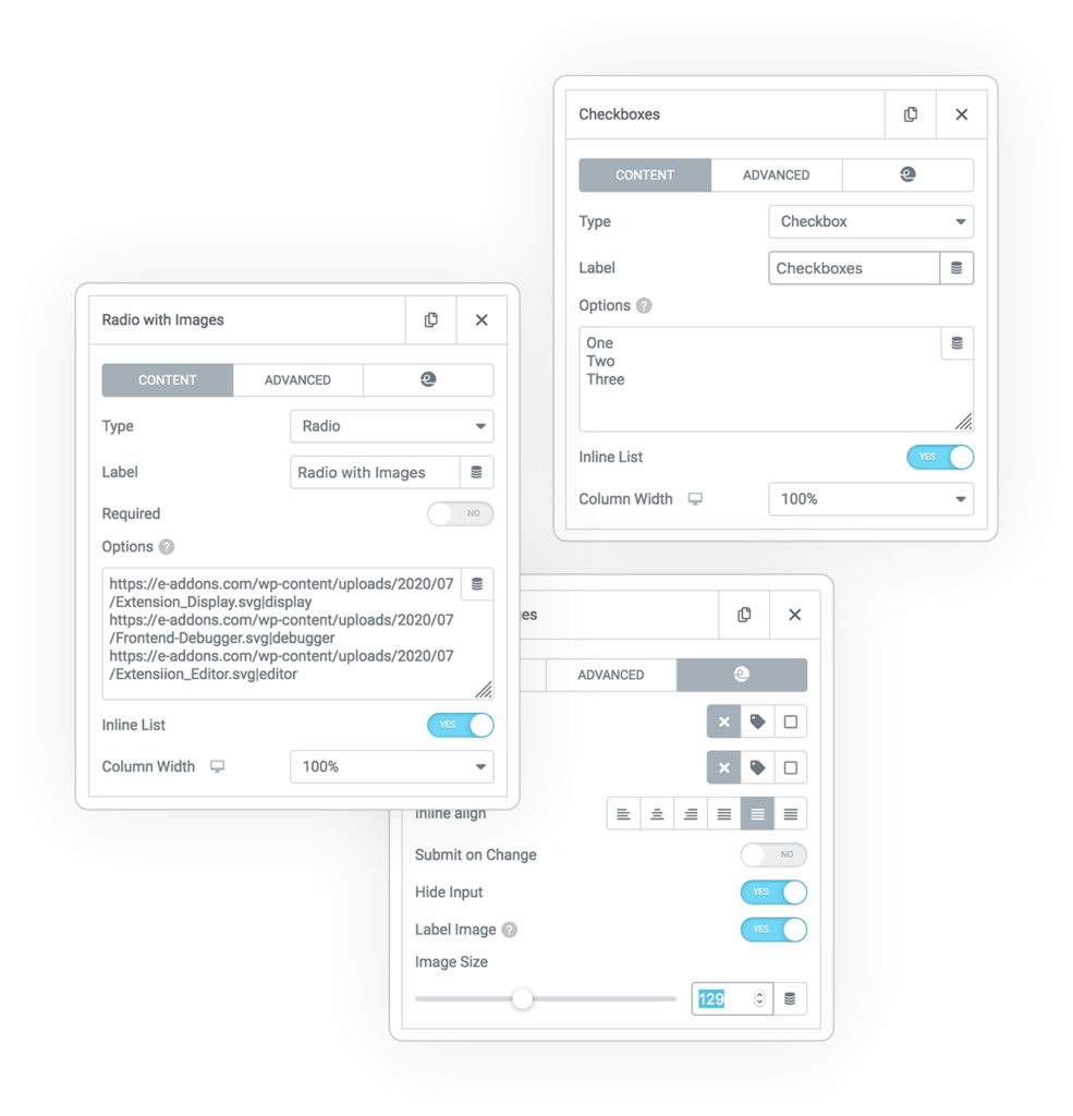
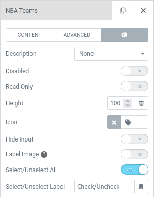
You can find this extra control on Form > Content > Form Fields > Your Field > e-addons Tab.
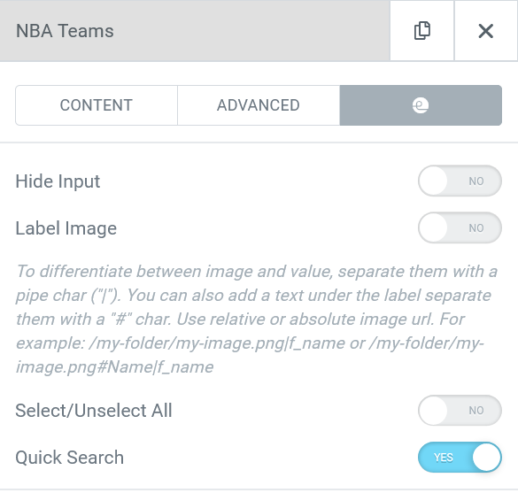
Hide Input
The radio and checkbox input will not be shown, so only the labels will be displayed for a more elegant solution.
Label Image
Use a custom image instead a simple text.
You have to define an image URL (absolute or relative) separated from value by the standard pipe (“|“) and automatically the image will be created as label.
For each Field you can define the Label Image size.
Optionally you can add also an extra Text above the image adding an “#” char after the image url.
Examples:
/images/thumb.png|green
https://mysite.net/one.jpg|one
/images/thumb.svg#Green|green
https://mysite.net/two.jpg#Two|two
Select/Unselect All
An extra Checkbox will be added before the option subgroup to let you quickly select/unselect them in bulk.
This option is available on:
- Select Multiple
- Radio
- Checkboxes
- Query Multiple
Select/Unselect Label
If you leave it empty the Checkbox will be positioned right to the field Label.
Some dedicated Styles are available on the related Tab.
Quick Search
Add an extra Quick Search field to filter your huge option list on any Radio and Checkbox
In this way your user could find quickly the wanted option and check it easily!
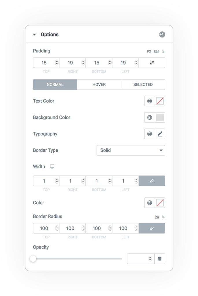
Options Style
On the Form > Style Tab there will be a new Section specific for Options.
Here you can find all commons style control to customize the options voices on their different state:
- Normal
- Hover
- Selected
DEMO
Options Extension
Order your Menu
An example where we used Image+Text instead the classic Radio/Checkbox appearance.
You can use as Option row the combination of elements. Example:
https://www.your.site/my-image.png#My txt|value
- # separate the image URL (relative or absolute) from the Label text
- | separate the Label (Image and/or Text) from the Value


 e-ProForm Extend
