Content
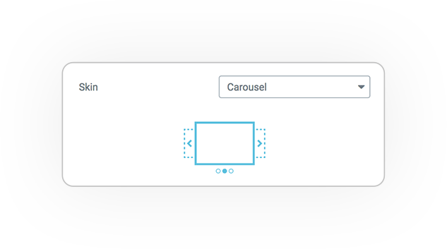
The skin carousel is responsive and allows you to manage the scrolling of blocks in 5 different visual styles: Slide, Fade, Cube, Coverflow, Flip.
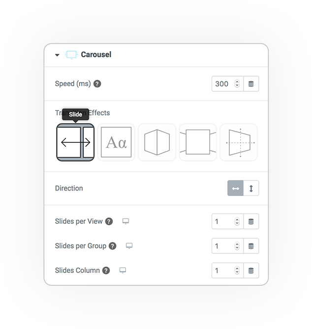
Slide
Classic scrolling
but also up to bottom, depends on the direction setting.
Slides for View
How many slides should be displayed.
Slides for group
How many slides must be moved when scrolling.
Slides Column
The carousel or slider can have multiple lines.
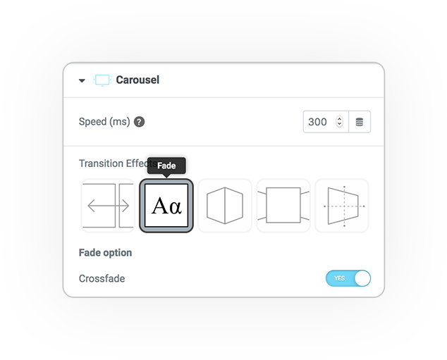
Fade
Scrolling in Alpha transparency.
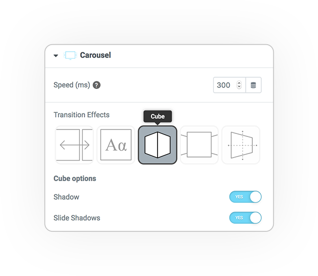
Cube
A cube rotates and shows the face with the desired slide on its front.
Shadow
The shadow under the cube.
Slide Shadows
The faces of the cube are shaded.
Coverflow
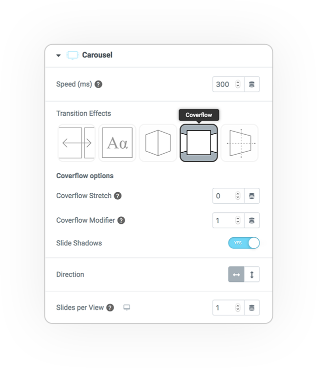
1/3 3d faces that slide in perspective.
Coverflow Stretch
The spacing between the slides in perspective.
Coverflow Modifier
The fold (z) of the distorted slides
Slide Shadows
The shadow on the distorted slides.
Slides per view
How many slides must be displayed.
We recommend 1 or 3.
Flip
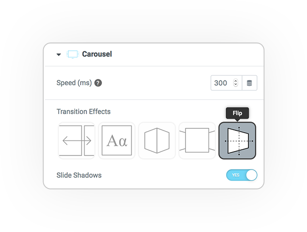
The flip effect rotates 360° only one slide like a sheet.
Navigation and scrolling controls
Direction
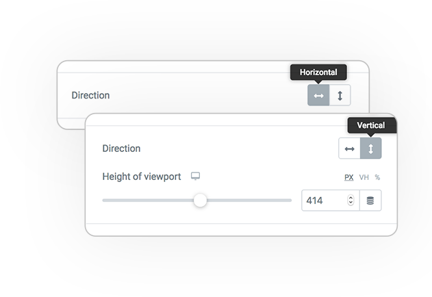
Direction affects the position of the Pagination and Scrollbar navigation elements:
- Horizontal
- Vertical
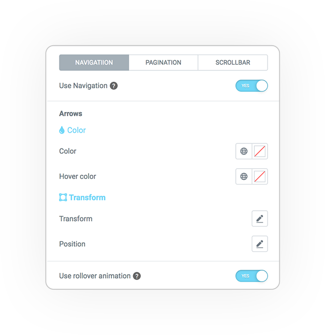
Navigation
The navigation arrows are based on svg designs and consisting into 2 parts: a line and a triangle (arrow).
You can model its graphic style and position.
- Color
- Thickness
- Dimension
- Position H/V
- Spacing
- Deviation H/V
Pagination
The progress and paging indicator:
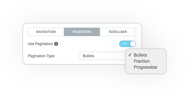
Bullets *
A sequence of dots placed side by side
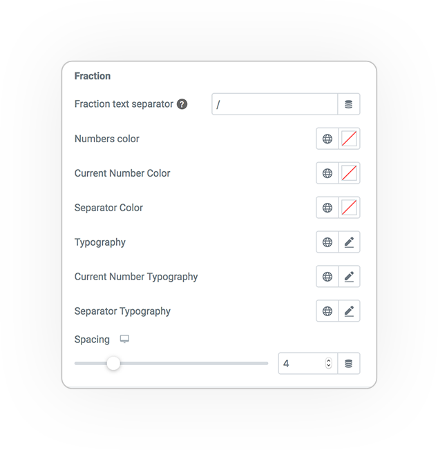
Fraction
Numbers with separator (ex: 2/5)
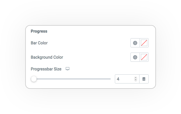
Progress
A colored progress bar
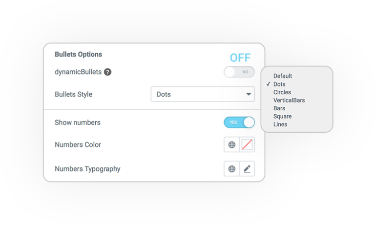
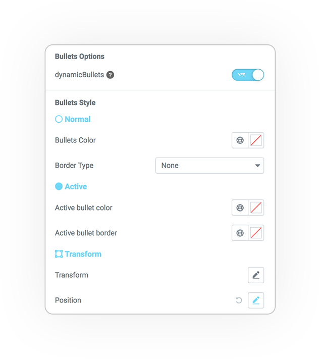
Bullets STYLE *
If “Dynamic bullets” is disabled you have other very attractive and original pagination styles:
- Dots
- Circles
- Vertical Bars
- Bars
- Square
- Lines
All have graphic styles for Color, size and spacing.
You can also view their active number.
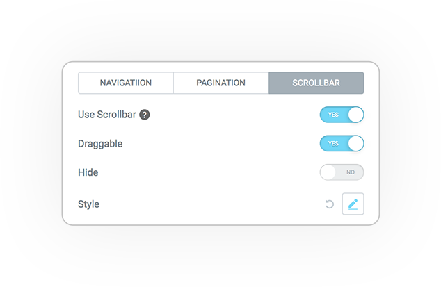
Scroll bar
Scroll Bar allows navigation through a scroll bar that can also be dragged.
Draggable
Activate the possibility of dragging
Hide
The bar pops up if the cursor is outside the carousel.
Graphic styles such as color and size allow you to customize the bar and track.
Options
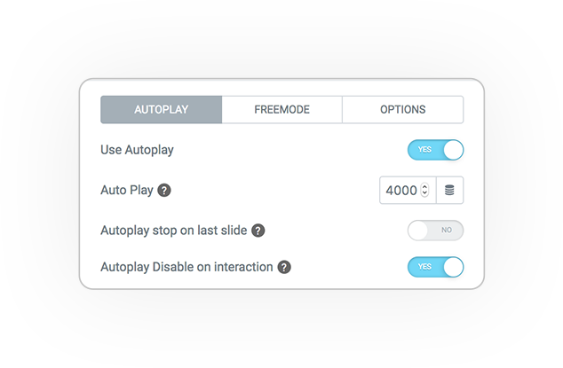
Autoplay
The slides scroll automatically.
Auto Play
The scrolling time / interval.
Stop on last slide
When you reach the last one, the automatic scrolling stops.
Disable on interaction
Scrolling is disabled at the first navigation interaction.
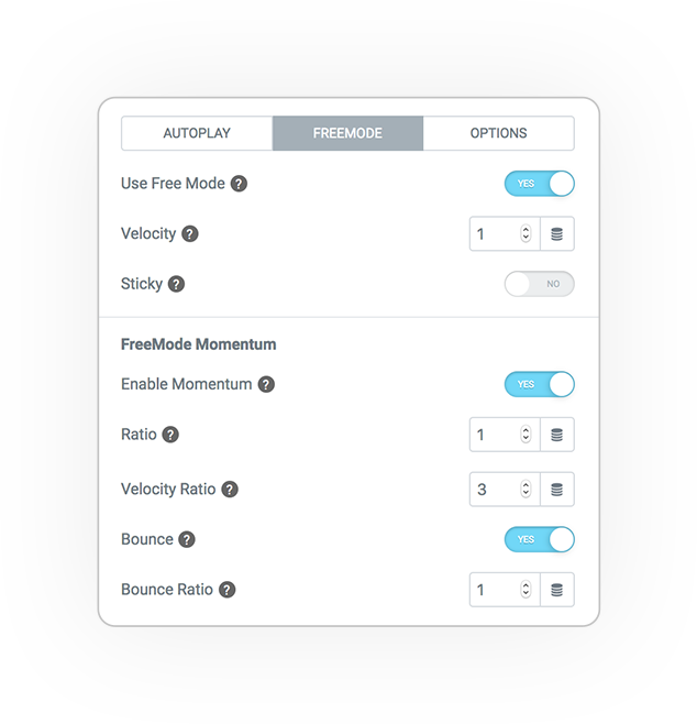
Freemode
Free Mode
Mode Momentum:
- Ratio
- Velocity ratio
- Bounce
- Bounce ratio
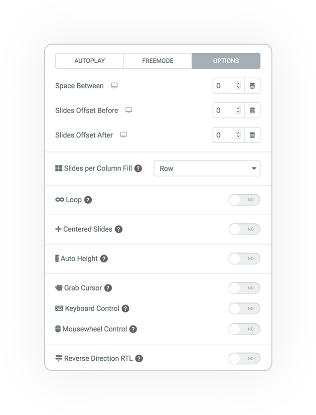
More options
Numerous options are available.
Spacing of the slider
Column fill
Left to right or top to bottom.
And many others:
- Infinity Loop
- Center slides
- Auto height
- Grab cursor
- Keyboard control
- Mousewheel control
- RTL
Style
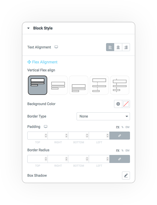
Block
These parameters allow you to control the graphic style of the blocks.
- Text alignment
- Vertical flex align
- Background
- Border
- Padding
- Margin
DEMO
Carousel
Base example


